
Hello CX Peeps!
I’ve just returned from a trip to Singapore where I was lucky enough to get to do some significant design work with a client.
For those of you have been a part of my CX peeps world for a while, you know that even though I’ve led CX efforts for years, my heart truly still loves where I started — on the design side. When I have a chance to return to designing experiences, it takes a brain shift. I have to get myself back to seeing things as a designer instead of as a coach. To get back to the basics of ethnography.
Singapore was a great place to do just that. It’s a magnificent blend of cultures and is often described as harmonious. It’s also an incredibly polite culture, based around respect and authority. After a few days of immersion, I was off and ready to work. And then I got a hankering for chocolate. This doesn’t happen very often to me — I’m way more of a salt-craver. Nevertheless, it was later in the evening, and I didn’t want to leave the hotel, so I went downstairs to the front desk and asked if they had a stash of chocolate.
They did. A KitKat.
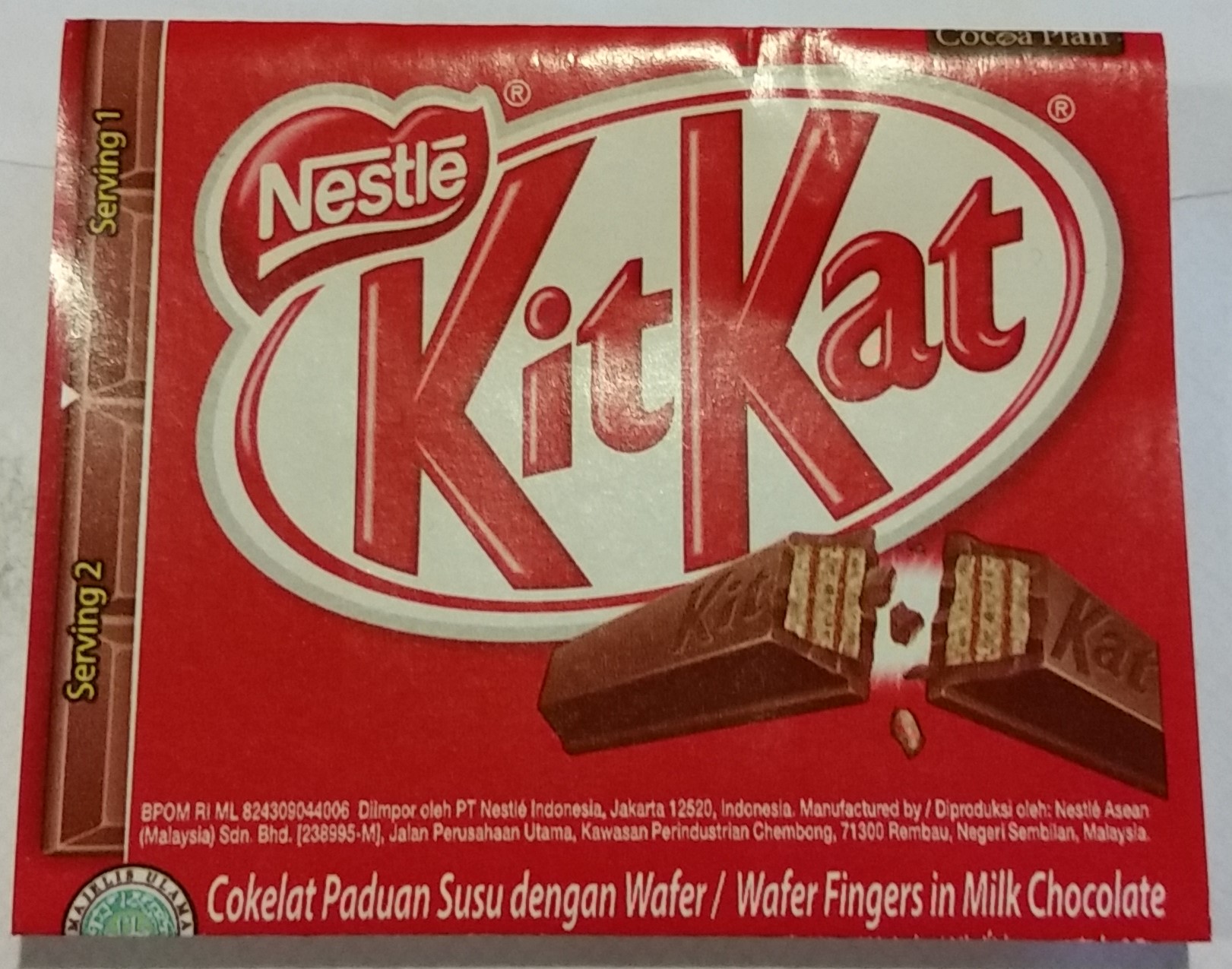
When I got back to my room, I took a moment and actually studied the KitKat. If you look at the picture, you’ll see that along the left-hand side of the wrapper is a very simple illustration that shows how many servings are in the package. Unlike the U.S., where we would either scream across the front “TO SHARE!” or bury the number servings in the nutrition info, the designer of the Singaporean KitKat wrapper solved for this in the simplest, yet most elegant, way. No recriminations. Just a tiny, effective nudge to remind me that there were two servings and that I either should share, or save a serving. All from this little design. This simple little picture that was oh-so-elegant.
It made me think about some of the best design decisions I’ve made throughout my career. And I’ll tell you, the simple ones are the ones that not only got the most attention (awards, press, white papers, etc.) they were the ones that had the biggest impact.
A quick look back:
Explanation of Benefits design
The explanation of benefits redesign we did in 2009 for a health plan. We realized that the behavior we wanted to impact was our customers’ understanding that their employers were picking up a huge part of the bill for their health care — which in turn, meant less out of pocket for them. Our solution? A simple circle at the end of each EOB that said “You saved.” Two words. Result? Decreased call volume, increased sentiment and increased loyalty to the employer.
24×7 for the first time in healthcare
Introducing 24×7 service into an industry. The company was trying to solve all sorts of problems in very complex ways, relying heavily on large scale digital investments —when at the end of the day, the solution we designed was to simply have a human available to answer questions 24×7. We learned that we could put all the sexy self-service/digital tools in the world into play, but that at the end of the day, sometimes people just want to talk to another person in their time of need. Result? Increased satisfaction, increased sentiment.
5th grade reading level = understanding
Transforming a large national retailer’s online Frequently asked Questions to a 5th grade reading level. We learned that there was really no need for incredible library curation tools, or infographics to show how things worked. We just needed to speak in plain language that everyday folks would recognize and could process. Result? Increased sentiment and decreased call volume.
I won’t mislead you – it took years to find these solutions. Finding the elegantly simple solution takes dedication and a willingness to think outside of the traditional approach to fixing problems. But it reaps major rewards.
So I’m challenging you. Stop for a moment, and think about these simple solutions that brought about massive results. Think about what you’re working on today. What are you missing? What could make the solution simpler? Easier to navigate? Faster to implement?
Sometimes the solution is as simple as showing me a picture to remind me that I’m only supposed to eat half the KitKat bar.